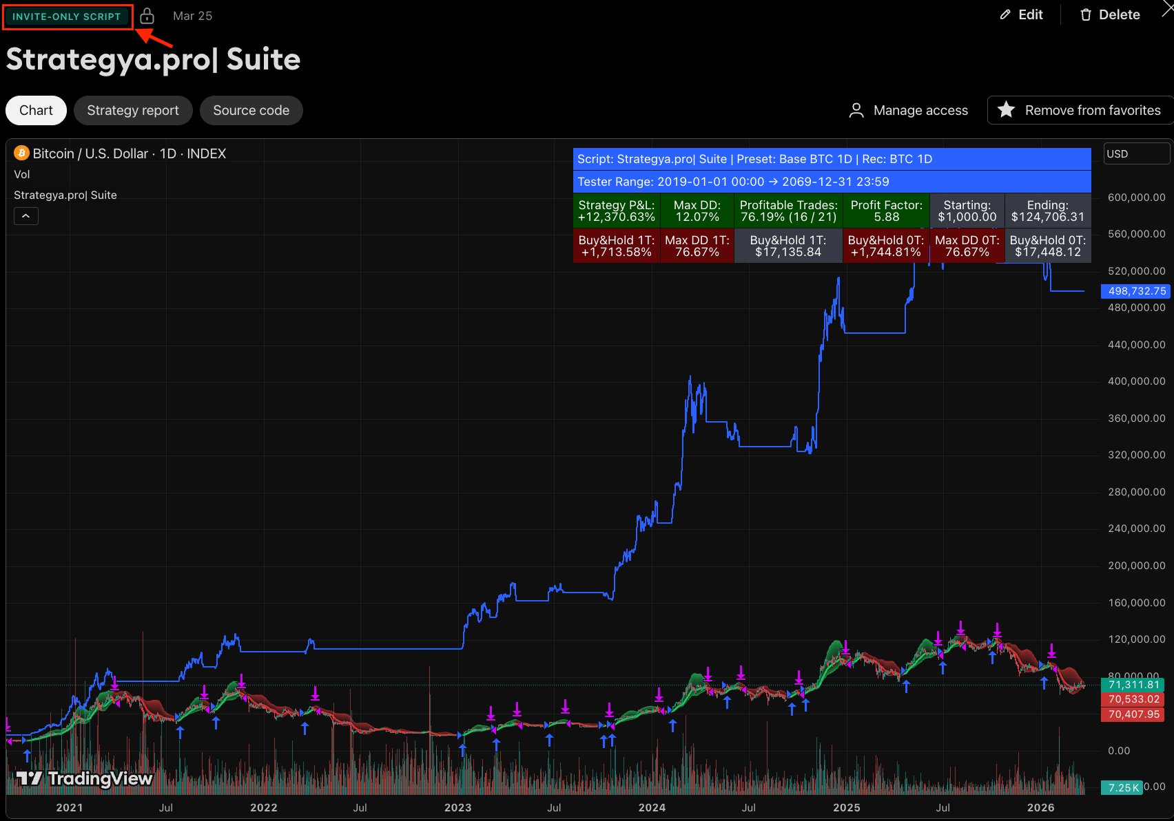
Strategya.pro | Suite
Everything you need to set up, configure, and read the signals from your algorithmic trading strategy on TradingView.
Getting Started
Strategya.pro | Suite is a single invite-only Pine Script strategy on TradingView that contains all configurations as presets. Here's what you need before you begin.
TradingView Account
You need an active TradingView account. A free plan works, but a paid plan gives you more historical data for backtesting. For the full experience, we recommend Essential or higher — it unlocks all timeframes needed by some presets.
Active Invitation
After subscribing at strategya.pro, you'll receive an invite to access the script. Your TradingView username must be registered — check your email for confirmation.
Add the Script to Your Chart
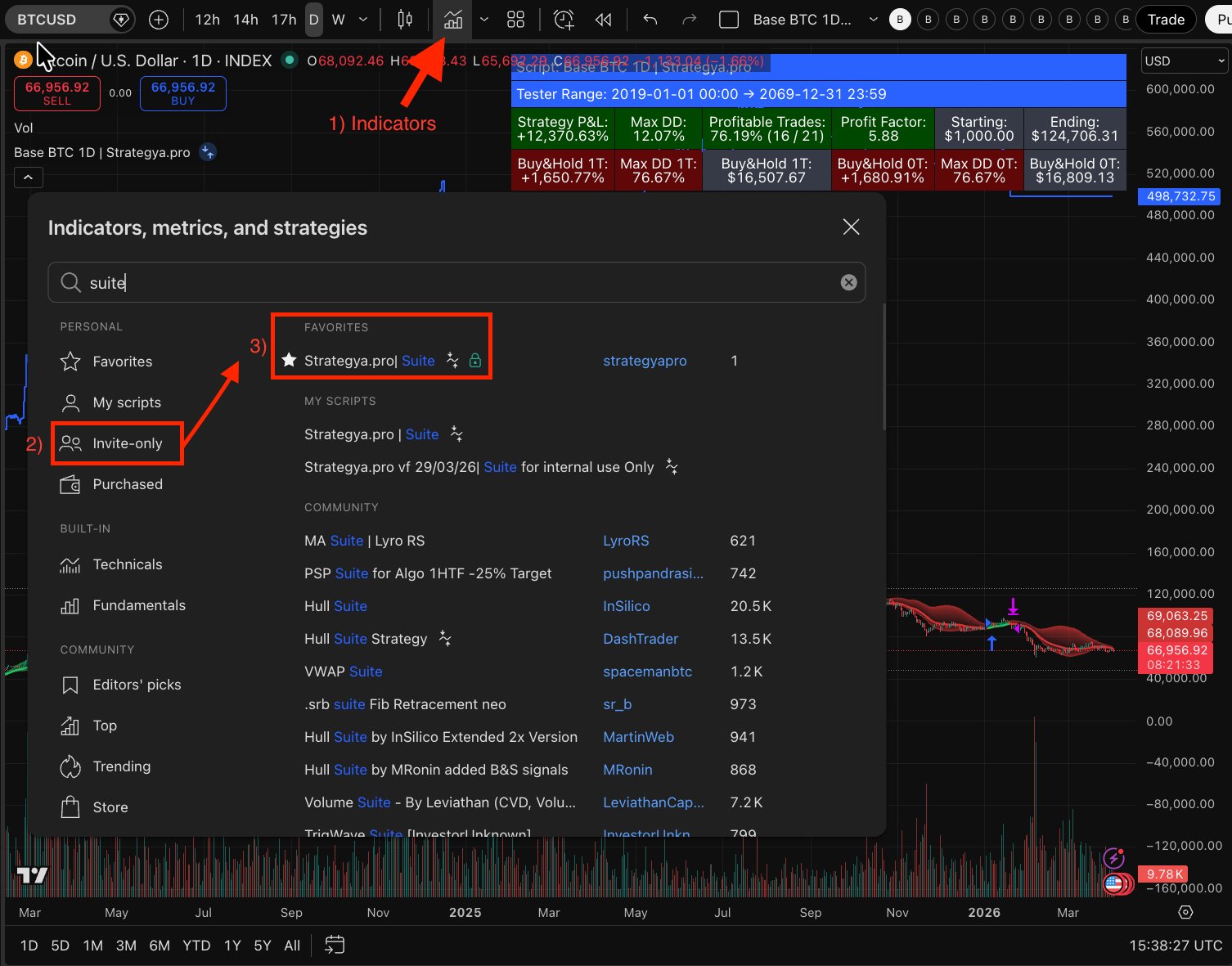
In TradingView, go to Indicators → Invite-Only Scripts → Strategya.pro| Suite and click to add it to your chart. The script will load with the default preset.
Select the Correct Chart Type for Bitcoin
For Bitcoin, always use the INDEX chart (BTCUSD — Bitcoin all time history index). In TradingView's Symbol Search, type BTCUSD and select the first result marked as index crypto INDEX. This ensures you're working with the full historical dataset, which is essential for accurate backtesting across all presets.

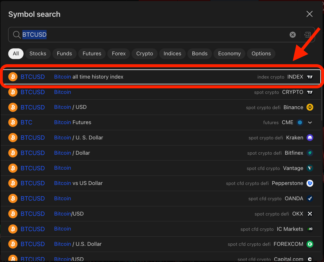
Chart Type Reference for Other Assets
The same principle applies to every asset supported by the framework. Below is a quick reference showing the correct chart type to select for each one:


Why chart selection matters: The Strategya.pro | Suite relies on volume data as a core input for its calculations. Always select a chart source that includes reliable volume — without it, the strategy cannot function correctly.
Crypto INDEX charts (BTC, ETH) aggregate data across exchanges, providing maximum history and consolidated volume. Exchange-specific charts (SOL, SUI on Binance) offer deep liquidity and accurate volume for newer assets. Stocks (TSLA) should always use their primary listing exchange to ensure official volume reporting.
Understanding the Chart Signals
Once the strategy is active on your chart, it displays visual overlays that represent the trading signals and market context.
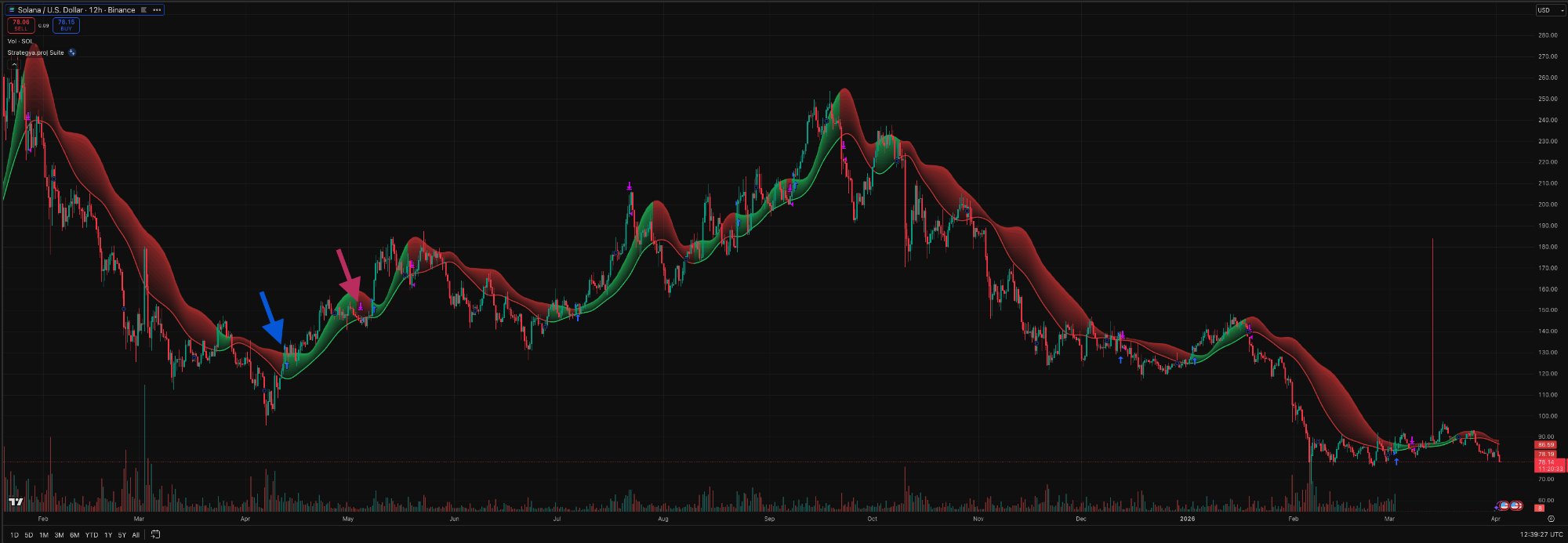
Green Zones
The strategy is in a long position. The green shaded area represents a bullish trend detected by the engine.
Red Zones
The strategy is in a no position / bearish context. The red shaded area indicates the engine has exited or is detecting a downtrend.
Entry Markers
Blue arrows or circles on the chart mark the exact candle where the strategy opened a position.
Exit Markers
Purple or red markers indicate where the strategy closed a position, either by signal or stop loss.
Reading the Strategy Report
TradingView's Strategy Tester shows the full backtest performance of the active preset. Here's how to read it.
Full Workspace Overview
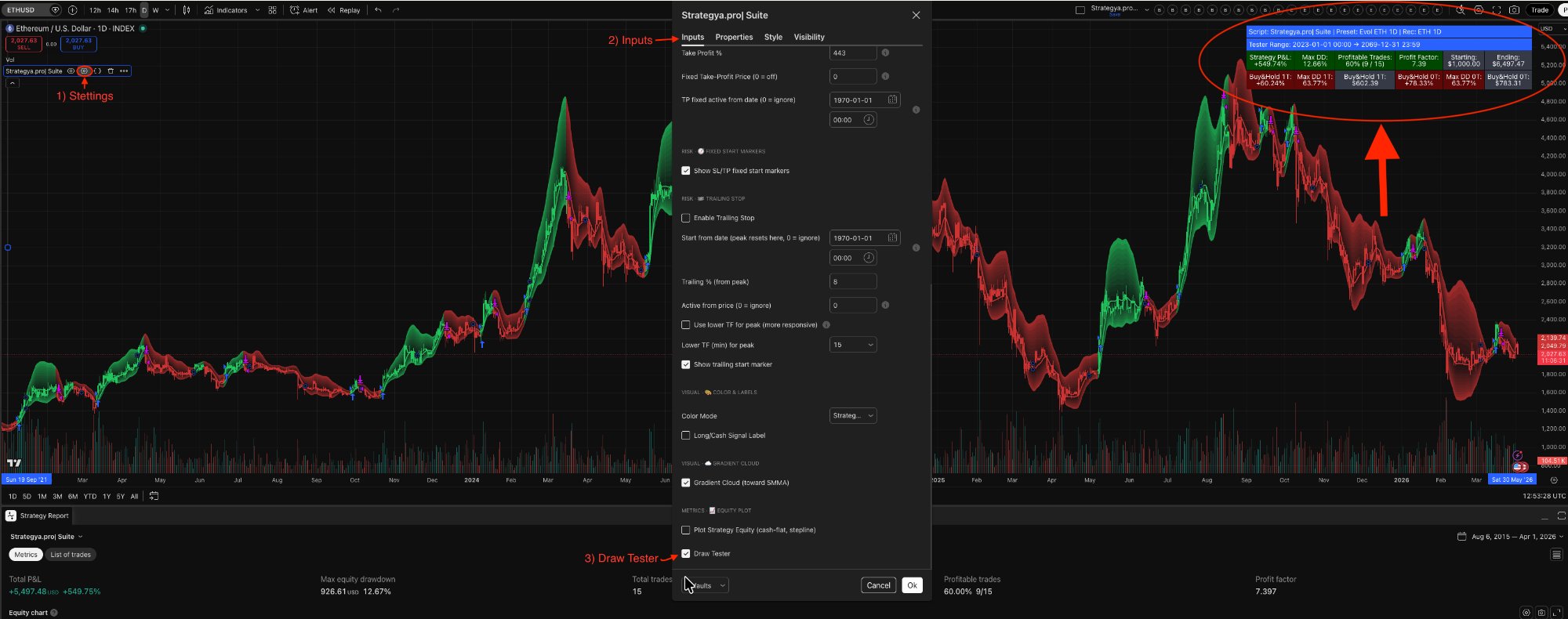
This is what your workspace looks like with the Suite fully configured. On the left, the chart with signal overlays. In the center, the Settings panel with all configurable inputs. At the bottom, the Strategy Tester showing key metrics like Total P&L, Max Drawdown, Win Rate, and Profit Factor.
Two Ways to Read Performance
The Strategya.pro| Suite provides two complementary views of your strategy's performance data.
The HUD (on-chart overlay)
This compact panel lives in the top-right corner of your chart and is exclusive to the Strategya.pro| Suite. It lets you evaluate performance at a glance — no need to open TradingView's Strategy Tester tab.
The top row shows Strategy metrics (P&L, Max DD, Win Rate, Profit Factor, Starting/Ending capital). The bottom row shows Buy & Hold benchmarks: from-first-trade (1T) and full-period (0T).
Cell colors are not fixed — they react to performance:
P&L turns green if the strategy beats both B&H benchmarks.
Max DD is green under 25%.
Win Rate is green above 50%.
Profit Factor is green above 3.0.
One scan tells you everything.
Strategy Tester (TradingView built-in)
This is TradingView's native reporting panel, available for any script that runs as a strategy.
Metrics tab — Total P&L, Max Equity Drawdown, Total Trades, Win Rate, and Profit Factor.
Equity Chart — A visual curve showing how your equity grew over the entire backtest period.
List of Trades — Every individual entry and exit with dates, prices, P&L, and run-up/drawdown per trade.
Open the Strategy Tester
Click the "Strategy Tester" tab at the bottom of your TradingView chart. If you don't see it, make sure the Strategya.pro| Suite strategy is loaded (not just an indicator).
Check the Overview Tab
The Overview tab shows the key performance summary. Focus on the metrics below — they tell you everything about the strategy's historical behavior.
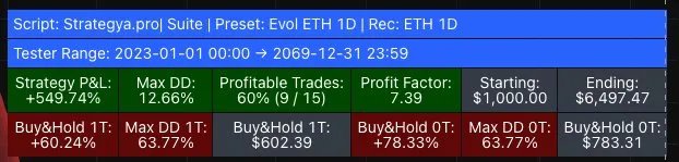
Key Metrics — Example: Evol ETH 1D
Preset: Evol ETH 1D · Rec: ETH 1D
Tester Range: 2023-01-01 00:00 → 2069-12-31 23:59
Illustrative example only · Evol ETH 1D · Jan 1, 2023 – Apr 2, 2026 · Past performance does not guarantee future results.*

Strategy Performance (Green Row in HUD)
Buy & Hold 1T — From First Trade Entry (Red Row in HUD)
1T = from the 1st Trade. What would have happened if you bought ETH at the exact candle where the strategy opened its first trade and held until the end.
Buy & Hold 0T — Full Tester Range
0T = zero Trades (pure hold). What would have happened if you bought ETH at the very start of the backtest period (Jan 1, 2023) and held until the end.
What Each Metric Means
* This section uses the Evol ETH 1D preset with a backtest period from January 1, 2023 to April 2, 2026 as an illustrative example only. Actual results vary by preset, asset, timeframe, and date range. Past performance does not guarantee future results. Always do your own research.
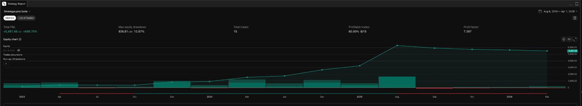
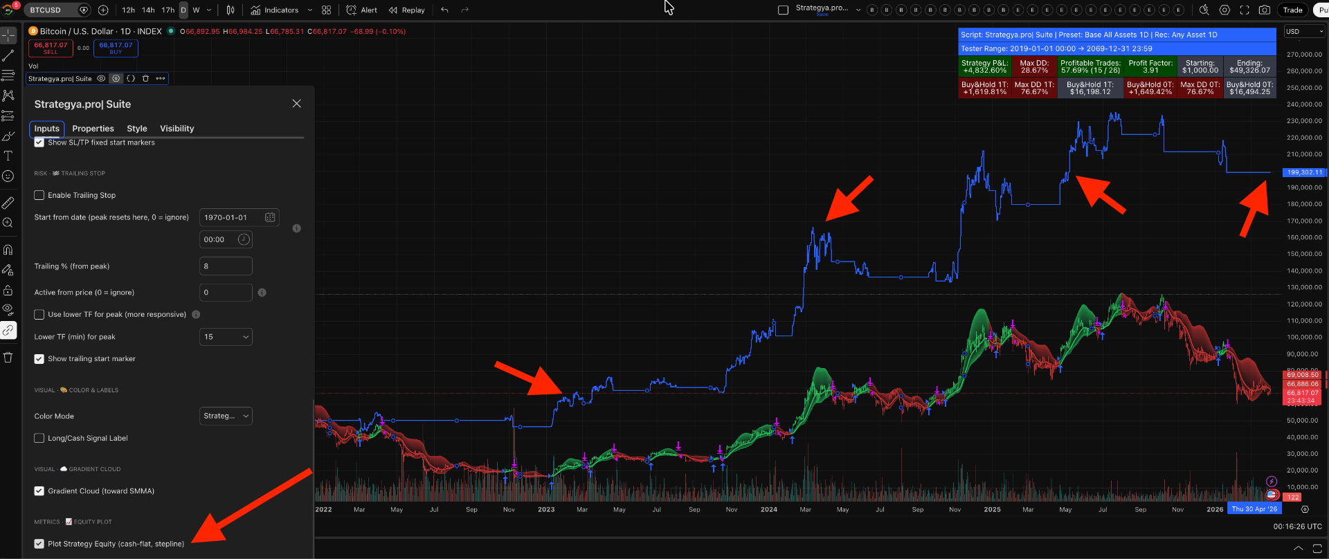
The Equity Curve
The equity curve is a visual representation of how your capital evolves over time as the strategy executes trades. It's one of the most powerful tools for evaluating a strategy's consistency and risk profile at a glance.
How to Enable It
In Settings → Inputs, scroll to the METRICS — EQUITY PLOT section and check "Plot Strategy Equity (cash-flat, stepline)". This overlays the equity curve directly on your price chart as a blue stepline.
How to Read It
Upward Slopes
Rising segments of the equity curve indicate periods where the strategy is generating profits. Steeper slopes mean faster capital growth. In the screenshot, notice the sharp upward moves during major BTC rallies.
Flat Segments
Horizontal sections mean the strategy is out of the market (cash-flat). No trades are open, so equity remains unchanged. This is how the strategy avoids drawdowns during unfavorable conditions.
Staircase Pattern
A healthy equity curve resembles a staircase — sharp steps up during winning trades, followed by flat periods while waiting for the next opportunity. This is the signature of a selective, momentum-based strategy.
Drawdowns
Any downward dip in the equity curve represents a losing trade or a drawdown. Compare the depth of these dips against the overall upward trajectory — small dips relative to big steps up indicate strong risk management.
Additional Visual Settings
The Settings panel also offers these visual customization options:
Risk Management Settings
The Suite includes three configurable risk management tools: Stop Loss, Take Profit, and Trailing Stop. All are found in Settings → Inputs.
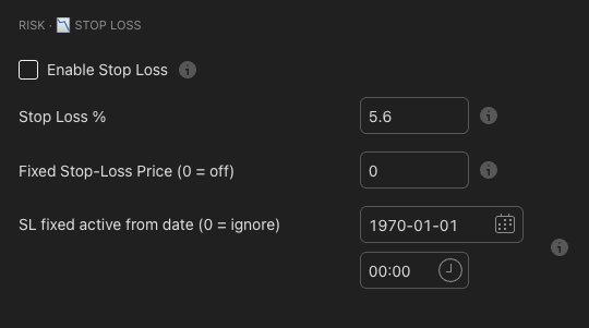
Stop Loss
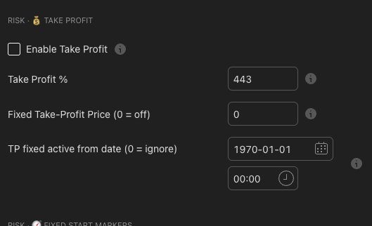
Take Profit
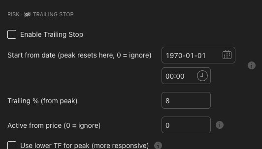
Trailing Stop
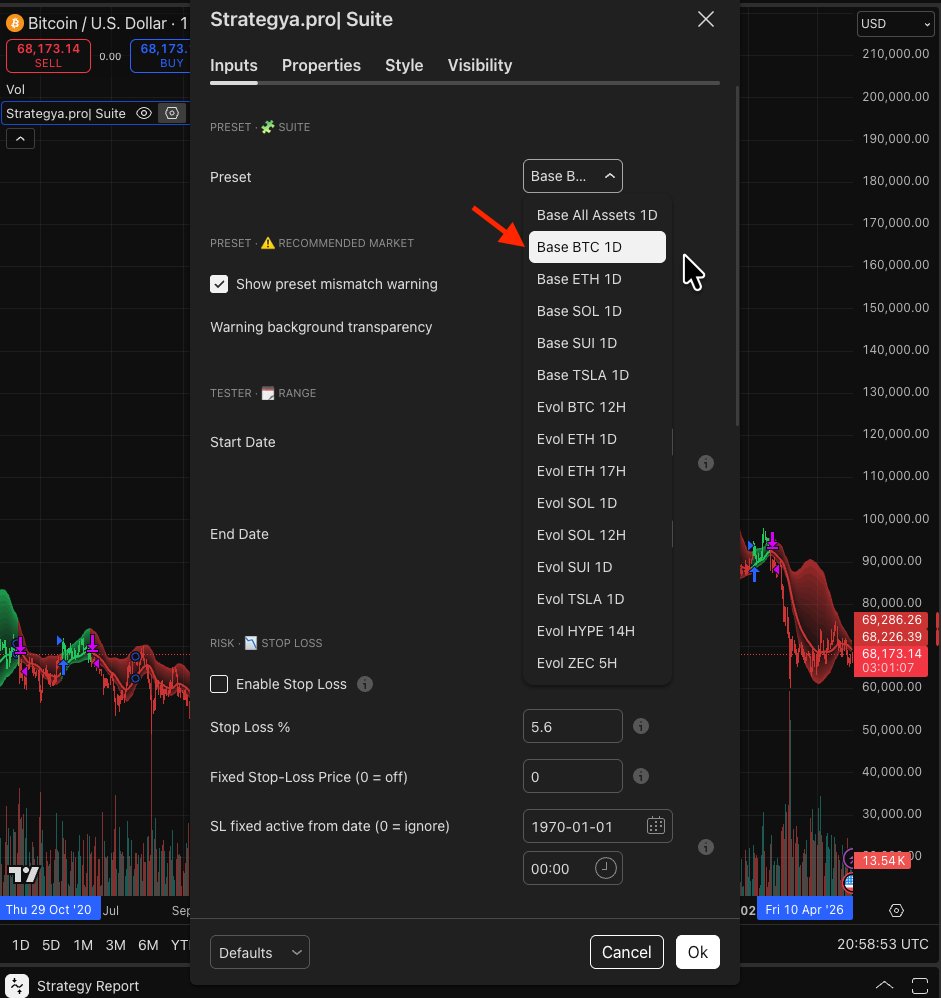
How to Select a Preset
Each preset is optimized for a specific asset and timeframe. Selecting the right one is the most important step.
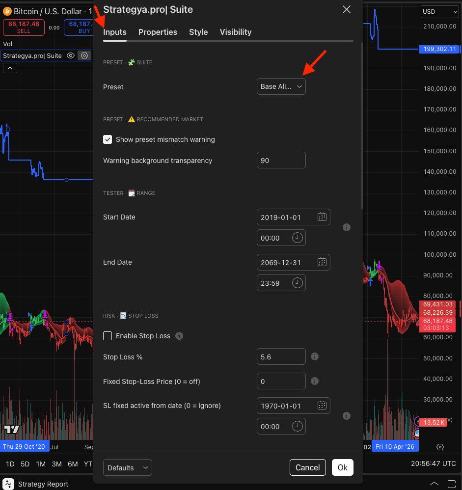
Open Settings
Click the gear icon (⚙) in the script panel on your chart to open the strategy settings window.
Go to Inputs
Inside the settings window, make sure you're on the Inputs tab (it's selected by default).
Find the Preset Selector
At the top of the Inputs section, under "PRESET — SUITE", you'll find the Preset dropdown.
Choose Your Preset
Select the configuration that matches your chart's asset and timeframe, then click OK.
Example: Base BTC 1D = Base family, Bitcoin, Daily chart.
Preset Families
BASE Steadier daily configurations — ideal for beginners and swing trading.
EVOL More adaptive configurations with a proprietary participation filter — higher selectivity.
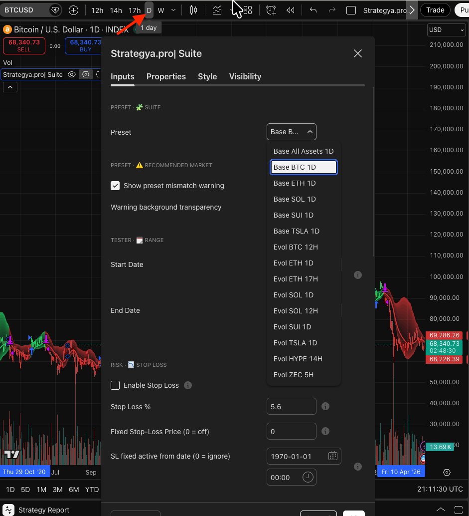
Examples: Matching Preset to Chart
Available Presets Reference
Complete list of all presets included in the Strategya.pro| Suite.
| Preset Name | Family | Asset | Timeframe |
|---|---|---|---|
| Base All Assets 1D | BASE | Any | 1D |
| Base BTC 1D | BASE | BTC | 1D |
| Base ETH 1D | BASE | ETH | 1D |
| Base SOL 1D | BASE | SOL | 1D |
| Base SUI 1D | BASE | SUI | 1D |
| Base TSLA 1D | BASE | TSLA | 1D |
| Evol BTC 12H | EVOL | BTC | 12H |
| Evol ETH 1D | EVOL | ETH | 1D |
| Evol ETH 17H | EVOL | ETH | 17H |
| Evol SOL 1D | EVOL | SOL | 1D |
| Evol SOL 12H | EVOL | SOL | 12H |
| Evol SUI 1D | EVOL | SUI | 1D |
| Evol TSLA 1D | EVOL | TSLA | 1D |
| Evol HYPE 14H | EVOL | HYPE | 14H |
| Evol ZEC 5H | EVOL | ZEC | 5H |
Preset Mismatch Warning
The Suite includes a built-in safety feature: if the selected preset doesn't match the chart you're viewing, a visual warning appears.
What triggers it?
The warning activates when the preset's intended asset or timeframe doesn't match the current chart.
What does it look like?
A colored background overlay appears on the chart area, making it immediately obvious that results may not be reliable.
How to fix it
Either switch to the correct asset/timeframe for your selected preset, or change the preset to match your current chart.
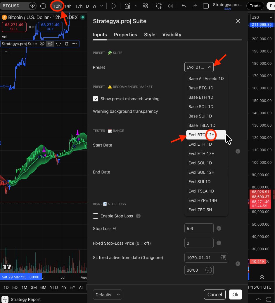
Example: Mismatch in action
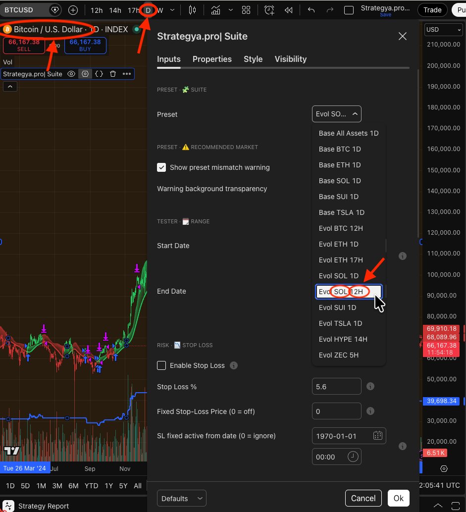
In this example, the chart shows BTC on a Daily timeframe, but the selected preset is Evol SOL 12H. The correct action is to switch to a BTC preset or change the chart to SOL 12H.
Controlling the warning
In Settings → Inputs, you'll find two controls: